The Supply Crunch in Luxury Homes 

The difference between a mortgage rate of 3%, where rates were four years ago, and 5.5%, where they are today, can make a significant difference in the monthly mortgage payment for middle-income buyers. Many are not able to buy homes they could have bought four years ago. So, they have a choice: Buy less of a house. Or don’t buy at all.

For high-income home buyers, that sort of interest-rate differential is not significant, and the demand for luxury homes is still strong. The problem, says California realtor Ken DeLeon, is that “the lack of supply almost perpetuates the lack of supply because sellers don’t have anywhere to go.” (Since 2000, the average monthly number of active existing-home listings has dropped 45%, according to a recent report.)

If you are interested, you can read more here.


A Different Kind of Dumb: How the US Sabotaged Itself in 1992

In this concise and amusing little essay, Bill Bonner explains how, in 1992, the US stood on top of the globe, with the world’s largest and strongest economy, a relatively happy and productive workforce, a strong dollar and a vibrant stock market, and what looked like the beginning of a new era of world peace.

But then…

Click here to enjoy Bill’s summary of how we F-ed it up.


Chart of the Week: The Speed of Compounding

When our nieces and nephews were young, K and I opened accounts for them. We deposited an amount of money that was not great, but enough so that if they wanted to, they could have used it to buy a late-model used car. However, we told them that we didn’t want them to spend it. We wanted them to save it. If they did, we explained, they would end up with a lotta, lotta money that they could use to add to the enjoyment of their lives when they retired.

This week, Sean gives us several charts that explain the “miracle” of compound interest. What happens, as you can see, is that it begins steadily and slowly. But then, after 20 and 30 years, it ascends steeply. The end numbers are truly mind-blowing. – MF 

Most people reading this have heard about the power of compound interest.

Compounding is a simple investment strategy in which you put your money in an investment that pays a cash return, such as a dividend.

You then take your cash return and reinvest it. Your reinvested dividend, or interest, then earns a return, too.

For a comparison, think about a snowball. As you roll the ball through the snow, the surface area gets bigger. The more surface area on the snowball, the more snow it picks up. The snowball gains mass slowly at first… but pretty soon, it’s so large you can’t stop it from rolling.

Now, you have probably heard that analogy before. But I don’t think it drives home just how crazy it gets when you’re able to compound wealth over a long period of time.

Because in reality, compounding does more than cause money to grow. It also causes the time you need to make money to shrink!

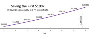
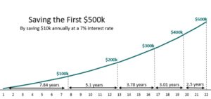
Imagine saving $10,000 every year and earning 7% compound interest.

The blog Four Pillar Freedom provides an exceptional chart of how this looks in action.

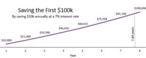
It will take you 7.84 years to crack the $100,000 level this way.

A long time!

But look what happens next…

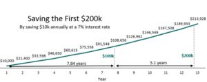
With the same investment and interest rate, it only takes 5.1 years to get the next $100,000.

Over time, the gap between $100,000 increments becomes shorter and shorter.

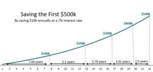
Although you’re still investing $10,000 per year, the money you’ve already saved has continued to compound.

By the time you’re going from $400,000 to $500,000, it only takes 2.5 years.

If you crunch the numbers, it takes more time (7.84 years) to go from $0 to $100,000 than it does to go from $600,000 to $1 million (6.37 years).

Isn’t that incredible?

That’s the hidden power of compounding.

Compounding does more than generate money faster and faster.

Compounding actually buys you more and more time the longer you take advantage of it.

This chart also shows why Charlie Munger was so adamant about scrimping and saving to get to your first $100,000 invested…

Because after that? It’s when compounding kicks into full gear, and your wealth goes crazy.

But the key to get there, as with most things, is consistency.

If you haven’t been putting aside any money before, now’s the second-best time to get started.

– Sean MacIntyre

Click here for a great video lesson on investing from Sean. 

And check out his YouTube channel here.

Chart of the Week: Interest Payments Explode 

This week’s chart is an appropriate follow-up to Sean’s April 22 column and my April 24 post on inflation. As you can see from the chart, the cost of servicing our now +/- $34 trillion debt – the interest the government must pay on it – is fast approaching a trillion dollars a year. As Sean points out, the US is barreling towards the possibility of a default, which would mean a massive collapse of the economy and the end of US dollar domination. 

He also tells you what he’s doing, in terms of his asset portfolio, to protect himself and his family from this possibility. – MF

For all the potential good and bad caused by government deficit spending, one thing is certain…

Every dollar spent beyond what the US brings in in tax revenue is a bill we’ll have to pay later.

The US has collected about $2.2 trillion in 2024 so far. It has spent, however, $3.3 trillion. (Click here.)

To cover these deficits, the US issues government bonds. As E.J. Antoni with the Heritage Foundation writes:

Between new debt issued to cover current deficits and old debt being rolled over, the Treasury will auction about $10 trillion of debt this year, much of it having an interest rate of about 5%. This is less than one-third of the federal debt but will cost $500 billion annually to service.

The rest of the debt, about 70%, will cost another $500 billion annually because the interest rates on the remaining notes and bonds are still relatively low. While that buys America some time to try and [defuse] this debt bomb, it still means we’re paying over $1 trillion a year just in interest on the debt.

Here is a chart showing how interest payments on US debt are exploding upwards in the wake of high interest rates and continued deficit spending:

This exploding cost to service our debts is moving the US ineluctably closer to a point of no return.

The government has three options: Move from deficit to surplus (unlikely anytime soon), let inflation go wild, or drop interest rates dramatically. Otherwise, the US will be in a perpetual debt spiral and will likely default, causing a catastrophic cascade of calamitous economic ramifications.

When will the US have to face a great reckoning?

According to economists at Penn Wharton, we have a bit of time:

Under current policy, the United States has about 20 years for corrective action after which no amount of future tax increases or spending cuts could avoid the government defaulting on its debt whether explicitly or implicitly (i.e., debt monetization producing significant inflation). Unlike technical defaults where payments are merely delayed, this default would be much larger and would reverberate across the US and world economies.

They note, however, that this timeframe is a “best case” scenario for the US.

If investors, businesses, or foreign governments lose faith in the US as a debtor, the timeline will likely accelerate.

In the nightmare scenario triggered by a government default, however unlikely, there could be a great churn followed by a great freeze. Big banks would have to find new assets to serve as collateral. And after that, many might step away from the markets entirely – making it more difficult to buy or sell any asset.

Most stocks would likely crash, too, as higher borrowing costs would stifle most lending and growth.

So how can one protect their money?

Tangible assets, like gold and silver, would be a good start. Some amount of foreign currency would be good, too. So might holding international stocks that issue dividends, as well as some basic materials and commodity stocks.

I have, for example, moved about 5% of my net worth into precious metals and foreign cash.

I do not believe a default will happen in my lifetime. But I do know that I’d rather have a fistful of gold and Swiss francs than even the slightest niggling bit of worry about what the future portends.

– Sean MacIntyre

Check out Sean’s YouTube channel here.

Trump’s Truth Social: Does It Have a Future?

I don’t entirely share Sean’s feelings about Trump, but in this video on Trump’s Truth Social stock, he does a clear (and amusingly sarcastic) job of not just telling us why its share price tumbled, but in explaining some of the fundamentals of how SPACs and IPOs work, and what investors should understand before they buy them.

The American Dream That Isn’t 

Emma Tucker, in the April 27 WSJ, says that young Americans are “getting left behind” in terms of enjoying the American Dream because of an unfortunate combination of historically high real estate and stock prices. “Higher prices are considered signs of a good economy,” she writes, “but for many, they hurt more than help.”

Read more here.

The Jamaica Exception

“The main two things that bring down a great nation are war and debt,” says Bill Bonner in the April 17 issue of Bonner Private Research, “and the US is not backing away from either of them.”

In this essay, Bill talks about how some countries in recent years have managed to avoid complete financial collapse by persuading their voters to go along with debt-reduction plans. But that is not even on the agenda of any of America’s politicians. Both Biden and Trump have proven to be relentless borrowers and spenders of taxpayer income. And neither has spoken a word about debt-reduction. The Biden administration, meanwhile, is moving us closer and closer to large-scale war.

Is there anything that can be done about it? Or should we, as individuals, privately plan for the worse?

Chart of the Week: Hot Inflation?

This week, Sean talks about an important subject I’ve never felt I understood well enough to bet on it: the government’s data on inflation. I’m guessing you feel the same way, so I’m going to turn this into an opportunity for you to learn from Sean along with me. I’m going to tell him what I think I know about this particular area of economics… ask him to correct or validate my ideas… and then report back to you on Wednesday. – MF 

Inflation came in hot in March, and now many people are asking whether this will delay Fed rate cuts.

As The Wall Street Journal reports, Fed Chair Jerome Powell “said firm inflation during the first quarter had introduced new uncertainty over whether the central bank would be able to lower interest rates this year.”

But I’m currently a little skeptical of this.

Inflation is not uniform. It doesn’t affect every commodity the same way, nor does it affect every region at the same time.

We can see that pretty clearly if we look at the major contributors to the consumer price index (CPI) inflation model over the last year:

While some major expenses like housing, electricity, and car repairs are pulling inflation up, we see food at home, vehicle costs, and other travel expenses pulling inflation down.

But since the recent “hot” inflation rating, many Wall Street prognosticators have taken to saying that there will not be a Fed rate cut anytime soon. Some even say that another rate hike is in order.

But, again, take a look at the chart above. Specifically, look at the rise in motor vehicle insurance and repair.

You have to ask yourself some simple questions:

* How would Fed interest rates work to quickly tamp down car insurance and car repair prices?

* Is this reading a chronic or acute problem?

* Can this be better explained by something else?

On that last note, let’s do a bit of logical thinking with car insurance and repair costs.

In the last few years, after new car manufacturing declined in 2020/2021, people resorted to buying used cars.

When people buy a lot of a thing, supply goes down and prices go up. This can show up in inflation models.

What do we know about used cars?

We know that older cars have higher failure rates, defect rates, accident rates, and fatality rates. We also know that older cars require more maintenance.

If you buy something that causes more accidents, has a higher chance of killing you, and costs more to repair…

Doesn’t it make sense that the surge in used car purchases in 2022 might cause a surge in car insurance and repair costs in 2023?

Now that used car prices have been deflating over the last year, we should also see insurance and repair prices level out a bit on their own in the months ahead. Without monetary policy intervention.

We can apply this same logical exercise to most of the categories seeing high inflation right now.

So right now, I am still thinking that the Fed might still be on track for at least one rate cut later on in 2024…

And I’ll explain why in more detail in next week’s column.

– Sean MacIntyre

Check out Sean’s YouTube channel here.

Chart of the Week: A Troubling Trend

M2 – otherwise known as “money supply” – is the term economists use to represent the amount of cash that is moving around in an economy at any particular time. It includes, as Sean points out below, such assets as the money we have in savings accounts, checking accounts, CDs, money market funds, traveler’s checks, and paper currency.

Money supply is not an indicator of the total net worth of an economy. Nor does it measure a country’s economic output. But it is a useful tool for economists because it can give them a hint about which way the economy is moving.

In the last two years, as the chart Sean presents demonstrates, M2 in the US has declined by more than 2%. That much activity has happened only four times before. And in each case, it preceded a major recession.

Thus, this latest two-year decline is something that all investors should be concerned about. But, Sean says, there is more to this recent turndown than meets the eye.

 If you are wondering how strong or weak the US economy will be in the next few years, take a good look at the chart and then read Sean’s cautionary analysis. – MF 

For all the talk of money printing that has pervaded media for several years, not many people have been talking about the money shredding that’s also been taking place.

Over the last two years, the money supply of the US has declined by over -2%.

Money supply, as measured by M2, tallies up all the cash-related assets held by households: savings deposits, balances in money market funds, paper currency, traveler’s checks, checking accounts, etc.

Less M2 means there’s less money floating around the economy.

And that has never been a good thing.

An analyst for Reventure Consulting looked at M2 going back to 1870. He found that there have been four times over the last 154 years when M2 fell by 2% or more: 1878, 1893, 1921, and 1931.

Those dates probably appear familiar to you because they also coincide with extraordinary unemployment, economic recessions, and massive stock market declines.

Why does this happen? When money supply is lower, people and businesses have – you guessed it – less money to spend. Consumption and investment levels decline, which can lead to deflation.

But here are the famous final words we must ask: Is this time different?

The previous declines in money supply did not follow unprecedented bouts of money printing.

The recent decline in M2 follows the Fed trimming the assets it had added to its balance sheet during 2008 and 2020, under a policy known as quantitative easing.

Despite the destruction of all this money, M2 is a whopping 35% higher than it was before the pandemic. There’s still plenty of money floating around the US economy. And the resilience of the labor market as well as the stickiness of our inflation problem suggests that the decline in M2 isn’t a serious problem yet.

What the decline in M2 does provide, however, is another troubling warning sign about the future of the economy and additional evidence that we should expect lower returns from US stocks in the years ahead.

– Sean MacIntyre

Check out Sean’s YouTube channel here.

New York City: Time to Sell? 

There is reason to believe that the current burden of the migrants taking advantage of New York City’s sanctuary city status may bankrupt it in the next 12 to 24 months.

The city’s current debt is $132 billion. And yet, Mayor Adams and other city officials are planning on spending a lot more between now and the end of 2025 to pay for the housing, feeding, clothing, and other needs of this additional population.

The city already provides undocumented immigrants with Medicaid and the full range of welfare services for the first seven years of their time spent in the city. City officials believe they will spend $12 billion by the end of the 2025 fiscal year on this alone.

And now they are working on the idea of giving the migrants $350 a week via prepaid debit cards that are supposed to be used to purchase food and supplies for babies. It’s a pilot program that will be tested on 460 families and will cost the city $600,000 a month, or $7.2 million in the first year. But as best as I can ascertain, since 2022, NYC’s migrant population has grown from about 560,000 to about 800,000. And if my arithmetic is right, that means the city would eventually have to come up with an extra $3 billion in taxes to expand the program.

On top of all that, they have a serious problem with office buildings being underoccupied since COVID that has been costing the city billions of dollars a year in lost real estate tax income.

Based on everything I’ve read, I’d not be surprised to see the city’s debt top $200 billion within the next few years.

The only way for Mayor Adams and city officials to try to avoid that would be to drastically increase taxes even more than they’ve already been doing – a tactic that has backfired, with wealthy residents and large, tax-paying companies beginning to relocate out of the city and into less costly municipalities.

If I owned property in NYC, I’d be looking to sell it now.

Chart of the Week: Time for Non-US Stocks? 

This week, Sean looks at the US stock market and highlights how expensive US stocks have become. (I’ve had conversations about this with several of the best analysts at The Agora Companies, which publishes dozens of economic, wealth, and financial advisories.)

From a value investing perspective, many US stocks, especially the sort of stocks we hold in the Legacy Portfolio are expensive – at a level that, like Sean, I’d be reluctant to buy more of them.

US stocks represent the majority of my investment in stocks, but stocks represent only about 20% of my wealth portfolio. Much of the rest is comprised of hard assets, real estate, and direct ownership of businesses, some of which are overseas. So, that gives my overall wealth portfolio some “anti-fragility.” If your wealth is primarily in US stocks, you should heed Sean’s warning today.

As US stocks inch ever higher, I find myself less interested in them.

I do not wish to overpay for something that, by any valuation measure, seems so unattractive.

This has led me to seek opportunities in gold and bonds. Now, I am looking at emerging markets.

Global markets excluding the US stock market have outperformed the US in five of the last seven decades.

It raises some questions: Why should this decade be different?

Many other investors are starting to ask the same thing.

According to analysts from Bank of America, the shift into emerging market and eurozone equities has been remarkable, with movement into non-US stocks the highest it’s been in seven years.

The last time we saw US stock valuations this high, in the year 2000, non-US stocks proceeded to outperform US stocks in seven of the following 10 years.

This is cause for concern because, simply, most American investors, especially index investors, believe they have a well-diversified portfolio. Yet most of them do not hold non-US stocks.

Having international assets, like real estate, can help hedge against currency fluctuations. They also allow investors to gain exposure to shifting growth trends.

The most exciting of those growth trends seem, to me, to be in South America, Central America, and Japan. (Though I am keeping an eye on Europe.)

Western Latin countries are benefitting heavily from the trend of nearshoring, where US firms are relocating manufacturing and operations to nearby countries.

And Japan is starting to see growth again after decades of stagnation.

One thing I will be doing in the coming months is looking for a non-US stock to add to the Legacy Portfolio. In July, I will be revealing what I discover on a stage in Tokyo.

But investors should consider shifting about 30% of their portfolio to non-US assets, like international stocks, now.

That might involve taking some gains on US growth stocks and moving them into non-US assets. Or it might simply involve buying non-US assets with your dividends or any new contributions you make to your investment portfolios.

– Sean MacIntyre

Check out Sean’s YouTube channel here.

Chart of the Week: The Effect of Interest Rate Changes 

Most Americans, including college-educated Americans, know little about economics and next to nothing about how the decisions made by the US Treasury and Federal Reserve affect the US economy. 

I was as ignorant as the next person until I went to work for a publishing company that specialized in following, interpreting, and predicting the investing markets. That was forty years ago. Since then, I’ve read reams of book chapters and essays on economic history and theory, as well as dozens of ideas about how to invest in the financial markets according to the actions of the Treasury and the Federal Reserve.

My level of understanding on this subject is still very basic. But I can say that I have come to a place where it is clear to see that fiscal and monetary policies do have big and undeniable effects on the financial markets, including not just stocks and bonds, but also every other asset class.

I have also learned that this is only a part of what one needs to know to make wise investment decisions. And that’s because the US economy, as large as it is, is nevertheless just a part of the considerably larger economy of the world.

This week, Sean presents us with several charts that track Japan’s fiscal and monetary policies and demonstrates, quite convincingly in my mind, why astute investors must understand what is going on there. – MF 

The media has been hanging on every word Jerome Powell utters. Investors want to know when interest rates will decrease.

But while this has been happening, there’s been a major development in global monetary policy that hasn’t generated enough attention.

Most developed nations increased rates to curb inflation, but the Bank of Japan was the last holdout.

On March 19, that changed.

In the wake of higher inflation and a weakening yen, the Bank of Japan raised their interest rates for the first time in 17 years.

Japan is usually late to the party when it comes to hiking interest rates.

Just as US central bankers are terrified of repeating the monetary policy mishaps of the 1970s that triggered a decade of stagflation…

Japanese central bankers do not want to repeat the monetary policy mistakes that cast a frost on their economy in recent decades.

This policy change is going to have a series of complex ripple effects through the global economy.

For one, the yen carry trade that has been generating huge amounts of money for US institutional investors will become less lucrative.

In a carry trade, investors borrow in a currency with a low interest rate and invests in a higher-yielding currency. A 3-month dollar-yen carry trade can earn as much as 5% annualized.

Secondly, because Japan tends to be late to hike rates, their monetary policy decisions are a bit of a “canary in a coal mine.”

For the past 30 years, their interest rate hikes have inevitably preceded global economic recessions.

Is this a clear sign that global economic catastrophe lurks around the corner?

I doubt it. It could be months or years before we feel the chilling effects of monetary policy changes.

But it is a sign that we should continue to be incrementally more cautious.

– Sean MacIntyre

Check out Sean’s YouTube channel here.

Chart of the Week: The Effect of Money Supply on Inflation 

I’m not a stock market analyst. I’m not even interested in stocks. But I have a sizable percentage of my wealth (about 20% to 25%) in stocks because the stock market is a historically strong developer of wealth, averaging about 10% over the last 200 years. 

About 12 years ago, working with several of the best stock analysts I know, I developed a system that I call Legacy Investing. It’s basically like investing in an index fund, but with some adjustments I made that I hoped would boost my return by 3% to 5% – in other words, give me the hope of being able to get a 13% to 15% ROI on my stocks over the long term.

So far, it’s worked out well. So I know the sensible thing to do is to is leave my portfolio alone, since trying to time the market’s ups and downs usually results in getting an ROI from it that is considerably lower than the 10% historical average. (Most individual investors trying to play that game earn about 2.5%.)

Notwithstanding this investing philosophy, I do keep my eye on about a half-dozen economic and market analysts who I know personally and whose thinking I know (from experience) is very good. And once in a while, when most of them are worried about the same dangers or excited about the same opportunities – and when their doubts and fears match my gut – I do make adjustments.

In the last year or so, I’ve become increasingly concerned about a significant drop in the value of my stock portfolio, and I’ve been thinking about what I can do about it. After reading Sean’s piece today, I decided to start taking some profits from my growth stocks and move that money into dividend-paying stocks and even some high-yielding but relatively safe bonds. – MF 

This week’s chart of interest comes from the folks at EPB Research.

To understand the pressure that money supply has on inflation, they compared the broadest measure of money supply (called “M4”) to the pre-pandemic trendline:

M4 measures how much money is in the US economy, including demand deposits, time deposits, and Treasury bills.

The quantitative easing during the 2020 pandemic flooded the economy with money through both monetary policy and fiscal stimulus.

Even with efforts to remove money from the economy, called quantitative tightening, we are still about 2.6% higher than where we would expect to be had trends continued from last decade.

According to the analyst Lyn Alden, “per-capita money supply growth is one of the most closely correlated variables to consumer price inflation.”

Naturally, with this above-trend supply of money, we see from the latest data that inflation remains stubbornly high as well – up 0.4% in February 2024, for a total CPI increase of 3.2% over the previous 12 months.

That’s far higher than the Fed’s 2% target, meaning that we should not be expecting a rate cut anytime soon.

But at the same time, if the Fed keeps tightening and reducing the money supply, there will be little money for economic growth. That means fewer jobs.

And even with Fed tightening, the big culprits in our sticky inflation problem are transportation services, shelter, and food away from home.

The Fed can print money. The Fed cannot print cheaper houses, cheaper cars, and cheaper food.

So even if the Fed does successfully tighten money supply back to “normal,” that still probably will not be enough to fix the inflation problem in the US.

At least, not anytime soon.

As we get closer to the end of the year, bonds and dividend-paying stocks are going to appear more attractive as growth projections appear more unrealistic due to all this sticky inflation.

Over time, this will likely cause stock market prices to drag – especially since growth stocks now make up an outsized portion of the overall market.

– Sean MacIntyre

Check out Sean’s YouTube channel here.

Chart of the Week: Is the Market Overbought? 

This week, Sean asks a question that many stock investors and most stock traders have been worried about recently: For nearly 90 days, the market has been outpacing expectations. Is it “due” for a drop. And if so, how deep and when?

His approach to the answer is technical: comparing this most recent three-month streak to streaks in the past, going all the way back to 1950. I don’t use historic patterns to determine what stocks I buy and sell, how much I’m willing to pay for them, and when to get into or out of them. But I do like to read technical analysis because so many things in the universe seem to happen in patterns. And when technical data supports the fundamental analysis I use, it does make me a bit more confident about my buying and selling decisions. – MF

There’s no denying that the market has been on a hot streak over the last 3 months.

But how much longer of a hot streak should we expect to see?

To find out, I looked at all the S&P 500’s 3-month returns since 1950. Then I found out what return in this timespan is way higher than normal (9.5%).

We can set that 9.5% line as our “overbought” level. Any higher? The market tends to slow down or decline afterward, as you can see from the spikes on the chart above.

By this measure, the market has been overbought since late December 2023.

At the time of writing, we’ve had 31 consecutive days that the S&P 500 has delivered an unusually large gain over the previous 3 months.

When the gain is this high for more than a month (about 20 trading days), we only see this streak continue to day 37 on average.

But if we only look at days when the market’s 3-month return has been positive overall, we’re at day 74.

When these positive gain streaks last longer than a month, the streak of positive returns lasts about 99 days on average.

That means, more or less, we should not expect the market to keep carrying on like this for much longer.

We should expect, very soon, the market to go sideways or down, even if just a little bit.

And this is okay.

The market, and money, are like the tide.

Water rolls in. Water rolls out.

Sometimes the market needs to go down before it can go back up again.

Just do not panic when we see the inevitable pullback.

– Sean MacIntyre

Check out Sean’s YouTube channel here.

Chart of the Week: From Your First $100,000 to $1 Million

Einstein once called compound interest the Eighth Wonder of the World. And when it comes to wealth building, it deserves that title, because its ability to grow your net worth over time usually amazes people the first time they come to understand it. In my book Automatic Wealth, I devoted more than a chapter to its power, including a number of examples that did a good job of demonstrating its potential. 

This week, Sean has found other graphic ways of demonstrating an aspect of this power that, although I understood it intuitively, I’d never thought about articulating in that book or others. If you are not a huge fan of compound interest, this will make you one. – MF 

Did you know that $100,000 is actually 25% of $1,000,000?

It’s true.

The reason this feels illogical is because most people think linearly. 1 becomes 2 becomes 3 becomes 4.

But with compounding, the logic is exponential in nature. 1 becomes 2 becomes 4 becomes 8.

And once we start thinking exponentially, we see just how powerful of a tool this concept is for building wealth.

The blog “Four Pillar Freedom” has an excellent example of how compounding works.

If you invest $10,000 every year and earn a 7% annual interest rate, your portfolio will grow to $100,000 in 7.84 years:

And if you continue to do this, you’ll get the next $100,000 in 5.1 years.

Do you see where this is going?

With the power of compounding, the amount of money you have invested over a long enough time determines how fast your money can grow.

But what few people realize is that it also shrinks the amount of time you need to generate the same amount of money.

By investing $10,000 per year at 7% interest, it would take 22 years to get to $500,000.

But to go from $500,000 to $1 million? It only takes 8.5 years.

All in all, if you can save $10,000 per month and generate 7% returns…

Which, by the way, you can beat pretty easily if you invest in a basket of large cap stocks that have a history of growth and rewarding shareholders over time…

It will take you a little less than 31 years to earn that first $1 million.

It took you 7.84 years to get your first $100,000. That’s a little more than 25% of 31 years.

You get that first $100,000? You’re already a quarter of the way there.

But as the late Charlie Munger said, “That first $100,000 is a b*tch.”

– Sean MacIntyre

Click here to watch Sean’s recent video about the most valuable mental trick he learned from Charlie Munger about building wealth. 

Chart of the Week: The Cluster of Woe

I’ve been in the economic and investment prediction business for more than 40 years, and many of my favorite colleagues have been occasional or perma-bears. I was once persuaded by one of them to buy a bunch of gold when it was priced at $400 an ounce. I’ll be forever grateful to him for that. But for the most part, I’d classify my thinking as pragmatically optimistic. I’ve always believed that if you managed your portfolio smartly, you could get richer every day and every month and every year.

About two years ago, I began to lose my optimism about the potential to grow richer. Especially if most of your assets were tied up in stocks. That gloomier outlook was based partly on fundamental and technical analysis of the markets (which Sean is very good at) but also on what I consider the rapidly moving decline of Western civilization and its values.

Today, Sean gives us his perspective. Reading it, I am more convinced than I have been in recent years that now is the time for caution and for rebalancing assets to be as anti-fragile as possible. – MF

There is now mainstream consensus that the US has moved beyond the risk of recession.

The stock market has soared to new highs with all the carefree hubris of Icarus.

But in the wings, there seem to be a few voices left to shout out sensible warnings.

Dr. John Hussman, who I discovered by way of Bill Bonner, suggests we’re in fact entering a “Cluster of Woe”

A confluence of economic and market indicators that collectively screamed alarm in in 1972, 1987, 1998, 2000, 2018, 2020, and 2022 – moments that preceded pretty sizable stock market losses averaging about -12.5%.

He provides this chart that shows the relationship between subsequent market returns and valuations:

We are currently sitting at the bottom right – the point where valuations look most insane, and the returns we should expect from the stock market over the next 10 years are not very good.

And we know the culprit.

The biggest cause of market overvaluations right now is tech and AI stocks.


Tech has pulled away so massively from the rest of the market that the market – weighted as it is by the perceived value of the stocks in it – has become an index of tech stocks.

Tech stocks now account for 29.5% of the overall market’s value.

One stock, Nvidia, has a larger market capitalization than every energy stock in the S&P 500 combined…

Despite generating only 14.4% of the net income of those companies.

Reader, we’ve seen this movie before. We know how it ends. And it isn’t “everyone got rich from tech stocks and lived happily ever after.”

Simply put, there’s probably a very good reason why Warren Buffett just sold some or all of Berkshire’s stake in tech-adjacent companies like Apple, HP, and StoneCo…

But bought more energy companies.

A cluster of woe is upon us. It is only a matter of time before investors finally realize it.

– Sean MacIntyre

Subscribe to Sean’s YouTube channel here.